Nutrilyze
Nutrition App
Overview
Nutrilyze is a native mobile application designed to help users make smarter dining decisions by translating complex nutrition data into simple, personalized scores. The app evaluates restaurant meals on a 0–100 scale and provides tailored recommendations based on individual health data, habits, and goals.
My Role: Product Design Lead (End-to-End)
I owned the design process from discovery through delivery:
Led requirements gathering and stakeholder alignment
Managed cross-functional communication to define scope and priorities
Designed UX wireframes and interactive prototypes
Created custom iconography and visual system for the app
The Challenge
Eating out makes it difficult for users to understand the true nutritional impact of their choices. Existing solutions either overwhelm users with raw data or lack personalization.
The opportunity was to:
Simplify nutrition into an intuitive, actionable format
Personalize recommendations based on real user data
Create a seamless mobile experience that fits into everyday decision-making
Approach
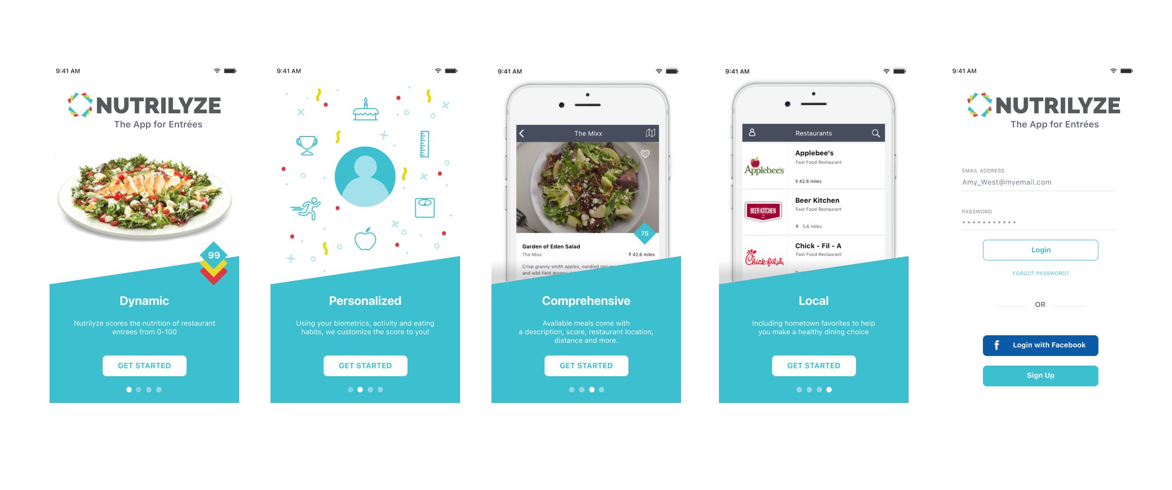
1. Defined the Experience Framework
I worked with stakeholders to establish core product pillars:
Dynamic: Real-time scoring of meals
Personalized: Tailored to biometrics and habits
Comprehensive: Context-rich meal data (location, description, distance)
Local: Relevant, nearby dining options
These pillars became the foundation for both UX and product messaging.
4. Monetization Through Value-Added Features
Premium features were designed to extend user value:
Ask a Dietitian: Real-time expert guidance
Nutrition Analysis: Insights based on dining history
These were positioned as lightweight, accessible upgrades within the experience, not disruptive paywalls.
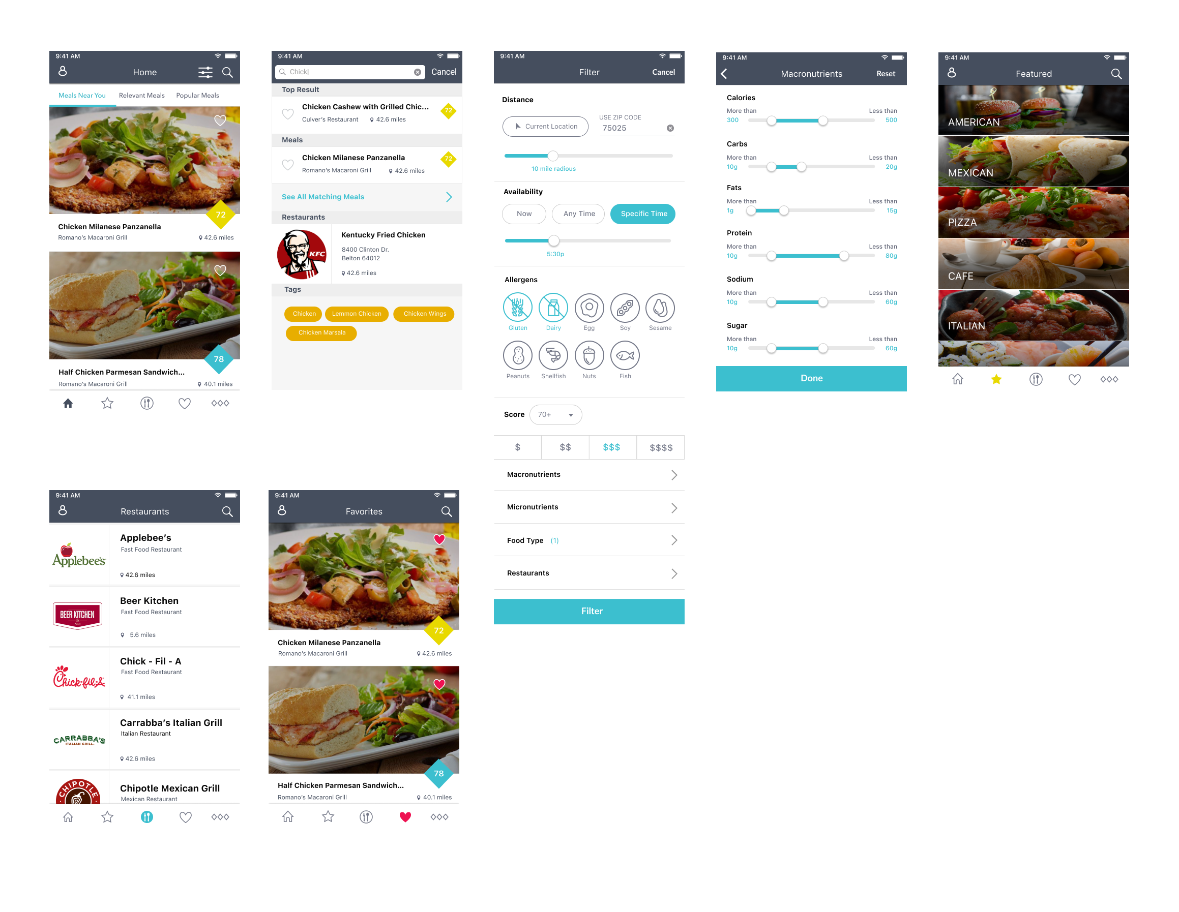
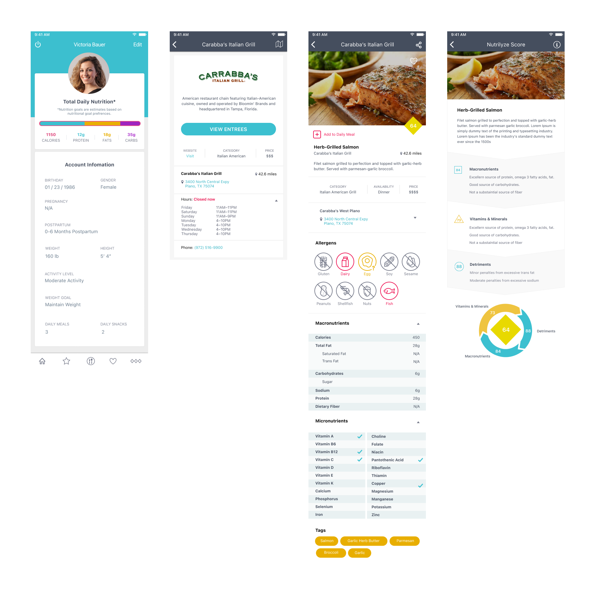
2. Simplify Complexity into a Scoring System
Instead of exposing users to dense nutrition labels, we defined a 0–100 scoring model that quickly communicates health value.
This allowed users to:
Compare meals instantly
Make faster, more confident decisions
Reduce cognitive load
5. Mobile-First UX & Visual System
I created:
Wireframes and high-fidelity prototypes for all core flows
A clean, card-based UI system for content clarity
Custom icons and visual elements aligned to health + simplicity
The design prioritizes: quick scanning, minimal friction, and clear calls to action
3. Design for Personalization
The experience adapts based on:
Biometrics
Activity levels
Eating habits
I translated this into UX patterns that feel intuitive rather than clinical, keeping the experience approachable while still data-driven.
Solution
Nutrilyze delivers a streamlined mobile experience where users can:
Discover meals nearby
Instantly understand nutritional value
Receive personalized recommendations
Access expert guidance when needed
The result is a product that bridges the gap between data and daily behavior.
Impact
Transformed complex nutrition data into an easy-to-understand scoring system.
Increased usability through clear, mobile-first interaction patterns.
Created a scalable foundation for personalization and premium features.
Delivered a cohesive product experience from concept to prototype.
Key Takeaways
Simplicity drives adoption, especially in data-heavy experiences.
Personalization is only valuable when it feels effortless.
Strong product pillars create alignment across design and stakeholders.
Designing monetization into the experience (not on top of it) improves user trust.